
Lessons from our Tropical Climate – How the Best UX Designs With the Environment
Discover how these lessons can be applied to industries such as finance, hospitality and healthcare.
Written by Shin Chan

Step outside in Singapore and the climate immediately asserts itself. The heat wraps around you, the humidity presses in. Sudden torrential downpours send people running for shelter, phones stashed away. As residents, we are used to navigating from shade to shade, timing our exits to the rain forecast, and subconsciously assessing the walkability of any route based on available cover.
This is more than just local colour. It’s a reminder that human behaviour is deeply shaped by environment. The same principle applies to the products we create.
Too often, we design for ideal conditions—perfect attention spans, fast networks, zero interruptions. But just as Singapore’s physical infrastructure adapts to rain and heat, great digital experiences are built around lived contexts. With our climate as our metaphor and teacher, here are some critical UX takeaways about designing for real life.
Design for real life contexts

Image: Sakura yu
Singaporeans are known for efficiency – even Singlish is built around saying the most with the least. Yet despite our love for cutting corners and saving time, we often choose the shaded route over the shortest one.
That’s because the climate doesn’t negotiate: the heat is relentless, the humidity clings. And when it rains, it pours. Our urban designers know this. That’s why we have an extensive network of covered walkways, underground link malls, and pavilions in all our parks.
The insight here isn’t just about city planning; it’s about UX.
In digital design, we often imagine users in ideal conditions: alert, focused, with full battery and strong signal. But real life just never works out like that. Users, like pedestrians, are shaped by their context, and the best design must consider environmental factors.
UX takeaway: Users operate within inescapable contexts—low battery, poor signal, noisy spaces, caregiving distractions, sweaty hands. Good design anticipates these realities:
Minimalist flows and clear instructions when cognitive load is high, such as doing mobile banking on a crowded train.
Seamless offline functionality for patchy networks

Spotify detects when the user is offline and provides options that allow for continued listening
Design for desire paths, not ideal paths
People don’t always follow the path you planned. In Singapore’s CBD, street-level crossings see heavy foot traffic during the lunch rush as office workers head out for food. But on rainy days, these paths are pretty much abandoned; instead, the second-storey network of twisting and turning linkways become a bustling artery of hungry people seeking shelter.

Image: Kaizenaire
The street-level paths, direct and quick, might be ideal, but both paths are designed for. People shift their behaviour based on context. These are desire paths in action—organic routes users choose, not necessarily the ones the designers prefer.
UX takeaway: Users will take the route that best suits their situation. Your product must make those routes smooth and intuitive. That means:
Smart shortcuts that emerge from behaviour, such as surfacing most-used actions on a dashboard.
"Repeat last transaction" or "Order again" options for users who just want to do the same thing quickly.

Amazon offers an easily-accessible ‘Buy again’ section that helps users quickly repeat a previous purchase, even as it recommends new products.
Don’t just optimize the flow you want users to take. Make the ones they already take easier.
Design with environmental friction, not against it
Hawker centres are one of the clearest examples of infrastructure designed to make the most of challenging environmental factors.

We don’t expect these open-air spaces to have air conditioning, cushioned seating, or queue-less ordering systems. Instead, the natural airflow, packed food stalls and brusque stall owner attitudes exchange reduced comfort levels for a significant benefit: low operational costs that trickle down into more affordable meals for consumers.
UX takeaway: Friction or constraints can be transformed into moments of value that add trust, familiarity and control to the user experience.
Two-factor authentication is often necessary; use that moment to communicate transparency and safety, rather than letting it feel like a chore.
Loading screens can become moments for micro-education, reassurance, or cross-selling.
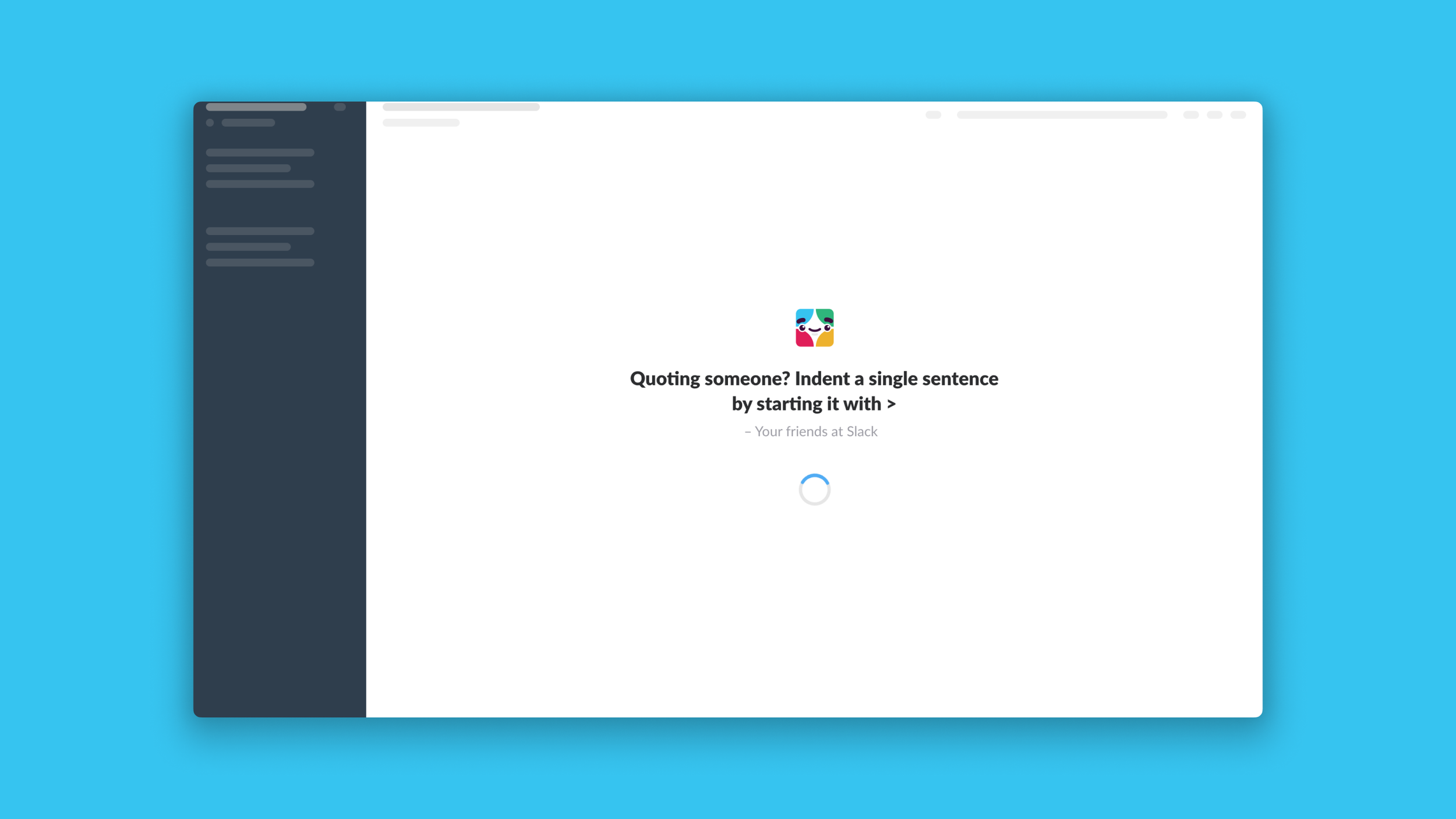
Slack’s loading screens offer helpful tips and uplifting messages that add value to a user’s work day.
Don’t just work around discomfort—design it into the experience, and capitalise on it for your product, user and business goals.
Applying Climate-Taught Lessons Across Industries
What does this mean for your product? The idea of factoring real-life contexts into product decisions cuts across brands, organisations and industries.

Singapore’s climate teaches us that behaviour doesn’t happen in a vacuum. People adapt to their environment—not because they want to, but because they must.
The best UX doesn’t fight that reality. It respects it, studies it, and designs with it.
In the same way our city is built to shade, shelter, and channel our movements, digital design should be grounded in the real, messy, complex lives and contexts of its users.
Understand your users’ lived environmental factors with PSYKHE’s Research & Insights expertise, or leverage our Product Design capabilities to deliver what your users actually need.